Designing a mobile friendly website
Saturday, April 18, 2009
0
comments
Hello Friends, After a long break, I have started writing again.
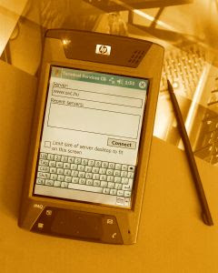
Recently I am working on mobile website and In this post I am talking about designing a search engine friendly mobile website. There are two major points that you should consider before making a website for mobile user:

Screen size (Choose generic common targeted screen size)
One of the biggest constraints of mobile is screen size and keyboard. Try to make your site for common targeted screen size, so that you can cover maximum user at a time. Today mobile screen size ranges from 176x208 to 320x480.
Vertical scroll is better than horizontal scroll
Horizontal scroll is not preferable for both desktop and mobile version of website. Keep entire content in vertical scroll so that user can easily press up and down arrow key and access it.
Typing - Minimize use of keypad
Typing is always painful on Mobile. Try to minimize use of keypad on mobile site. Make the site more click based. Incase user input is required, use auto suggest.
I will cover more points on mobile search optimizations in my next post.
Recently I am working on mobile website and In this post I am talking about designing a search engine friendly mobile website. There are two major points that you should consider before making a website for mobile user:

- User Experience (Usability)
- Browsing Cost
1. User Experience (Usability):
This is most important point that you should consider during mobile website development. Generally mobile user is totally different from a person who is accessing information on desktop/laptop PC. Mobile users have limited facilities. They cannot type like a desktop keyboard, they can't view like a desktop screen etc. So the experience is totally different here.Screen size (Choose generic common targeted screen size)
One of the biggest constraints of mobile is screen size and keyboard. Try to make your site for common targeted screen size, so that you can cover maximum user at a time. Today mobile screen size ranges from 176x208 to 320x480.
Vertical scroll is better than horizontal scroll
Horizontal scroll is not preferable for both desktop and mobile version of website. Keep entire content in vertical scroll so that user can easily press up and down arrow key and access it.
Typing - Minimize use of keypad
Typing is always painful on Mobile. Try to minimize use of keypad on mobile site. Make the site more click based. Incase user input is required, use auto suggest.

2. Browsing Cost:
In comparison to normal broadband internet connection, GPRS is costly. You should consider browsing cost for your website. Unlimited connections facilities are still not available on major countries. Although unlimited data connections facility is available on developed countries but in developing country it will take some time.I will cover more points on mobile search optimizations in my next post.